Redesign of unhcr.org
Designing for clarity across a global network
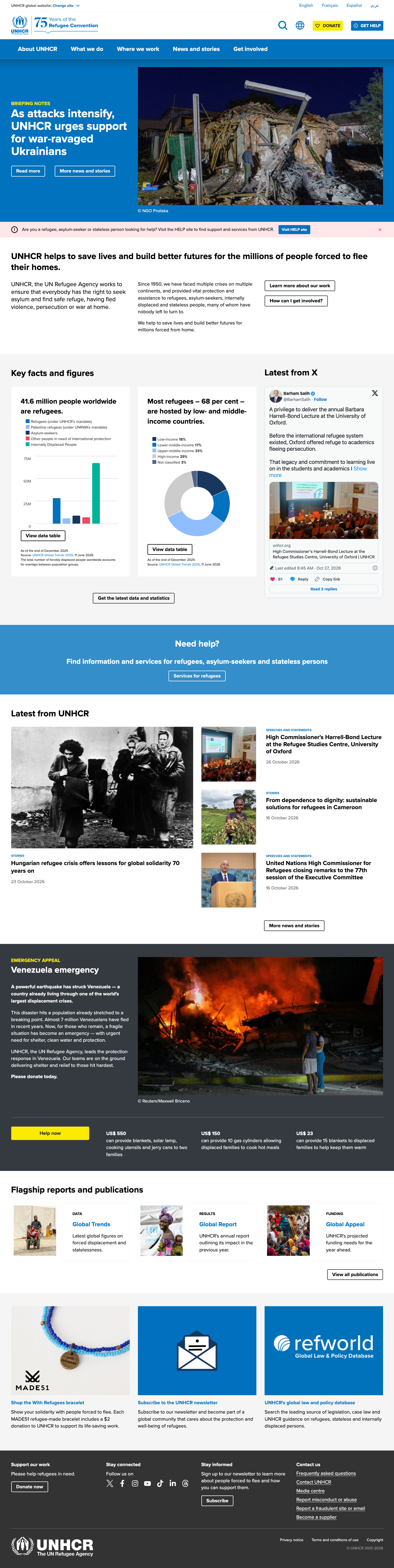
Leading the UI redesign of UNHCR’s flagship website. I set the visual direction and designed the core templates and components that now run across 50+ sites and form the foundation of the UNHCR UI toolkit.
Role
UI design lead: visual direction, style sheet, core page templates and components
TEAM
UNHCR Digital Service and Vardot (Drupal development)
Timeline
April 2021 – August 2023
(main design sprints July 2021 – September 2022)
REACH
50+ sites across the UNHCR network
The brief
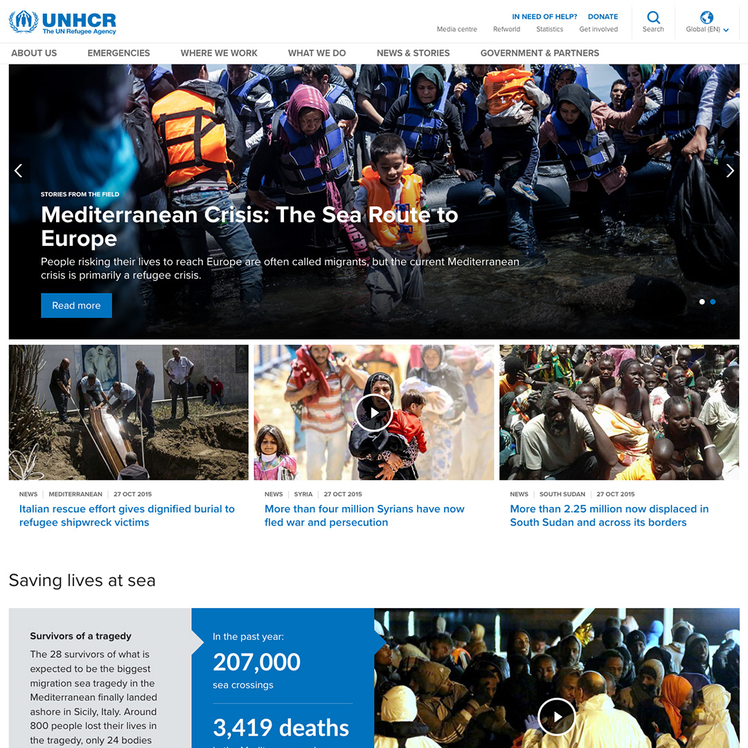
UNHCR.org had last been redesigned six years earlier. Users still found it attractive and easy to use, but user testing had uncovered usability problems that held back the experience. Site editors also reported that the templates were too rigid for the range of content they needed to publish.
I led the UI design and set the visual direction for the rest of the Design team. I worked closely with our User Research and UX colleagues to turn their findings into design concepts, tested those concepts, then prepared desktop and mobile designs for an external agency to build as Drupal components and templates.
The challenges
Important content was buried.
Few desktop users scrolled past the homepage first carousel slide. The data pages, which matter a lot to UNHCR’s audiences, were hard to find. Links to reports, statistics and the Help site sat inside sentences as plain text links and people skipped over them.
Users were getting lost.
Testing showed that people missed key links such as Data, Help and Donate. They often couldn’t tell whether they were on the global site or a country site.
Editors needed more flexibility. Editors wanted to place components in any order, use different types of photo, and remove the hero slider when it didn’t suit their page.
One design, many sites.
The design had to work for global, country, emergency and campaign sites, while staying consistent across all of them.
What I designed
The visual foundation.
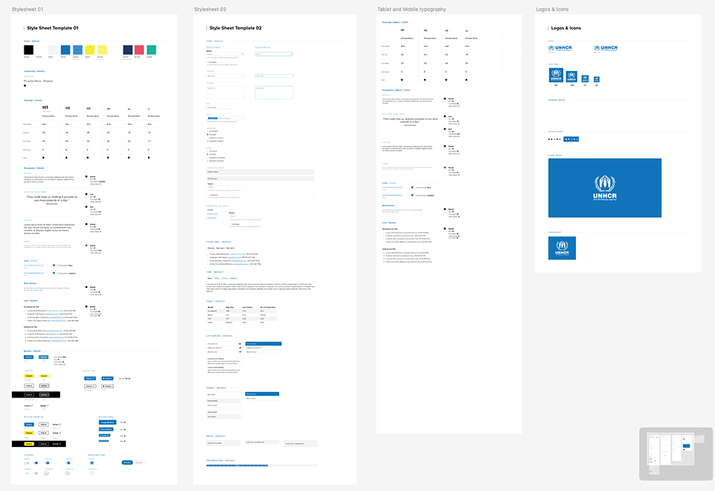
I created the overall style sheet: typography, colours and button styles. It set the visual direction for the whole Design team, and later became the base of the UNHCR UI toolkit.
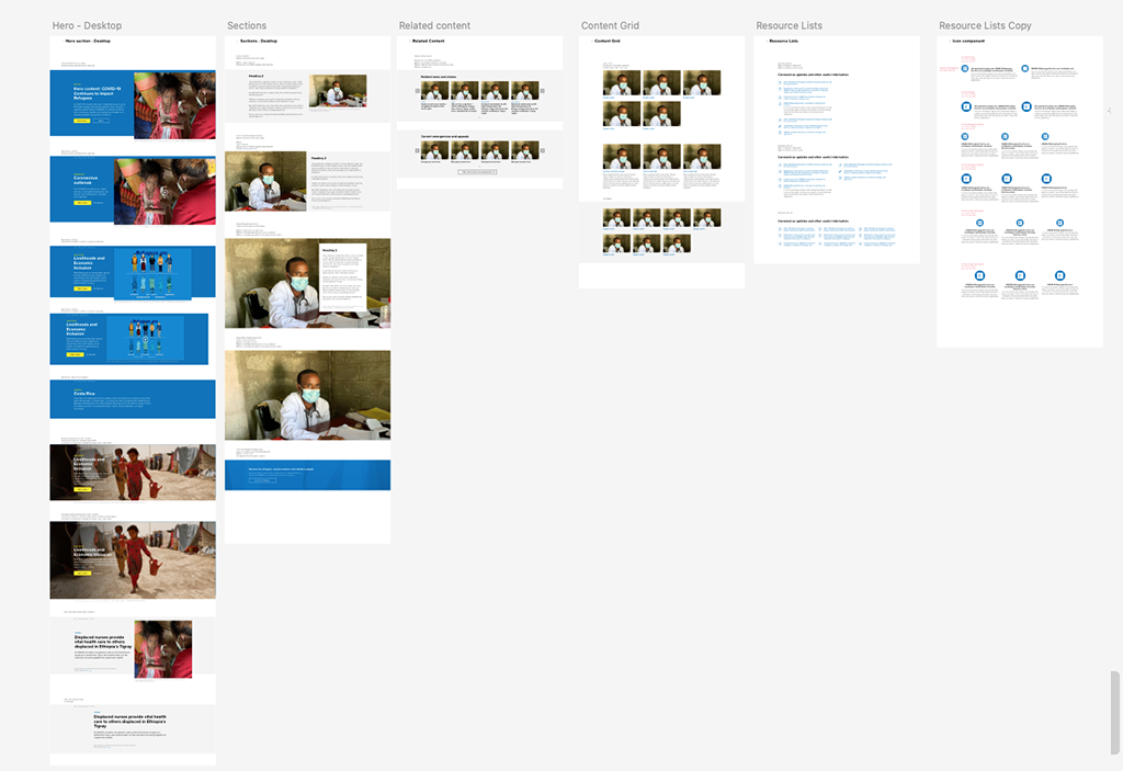
Reusable components.
Hero sections · Emergency sections · Data cards · Featured news blocks · Related news. With a focus on editor usability, the number of image crops for components was reduced from 10 to 4 with standard ratios that worked for most photos.
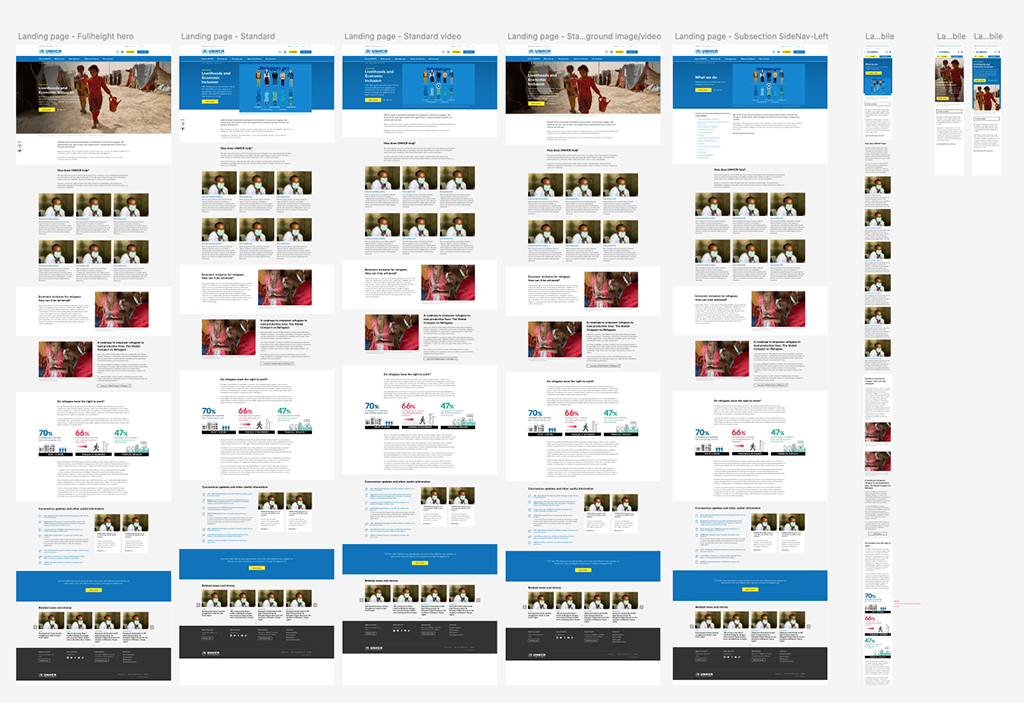
Page templates.
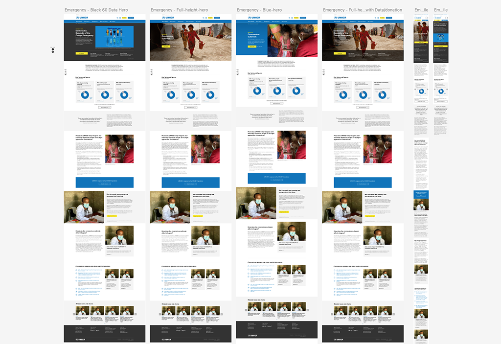
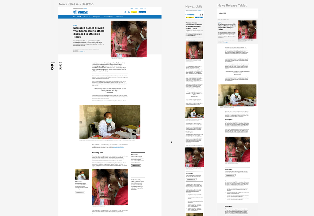
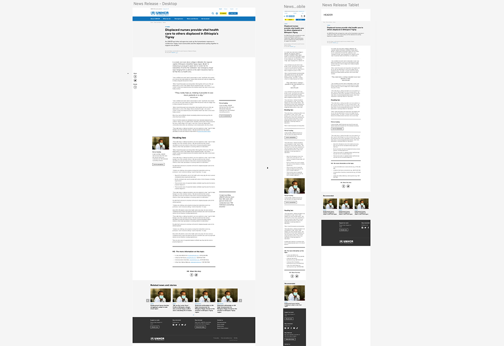
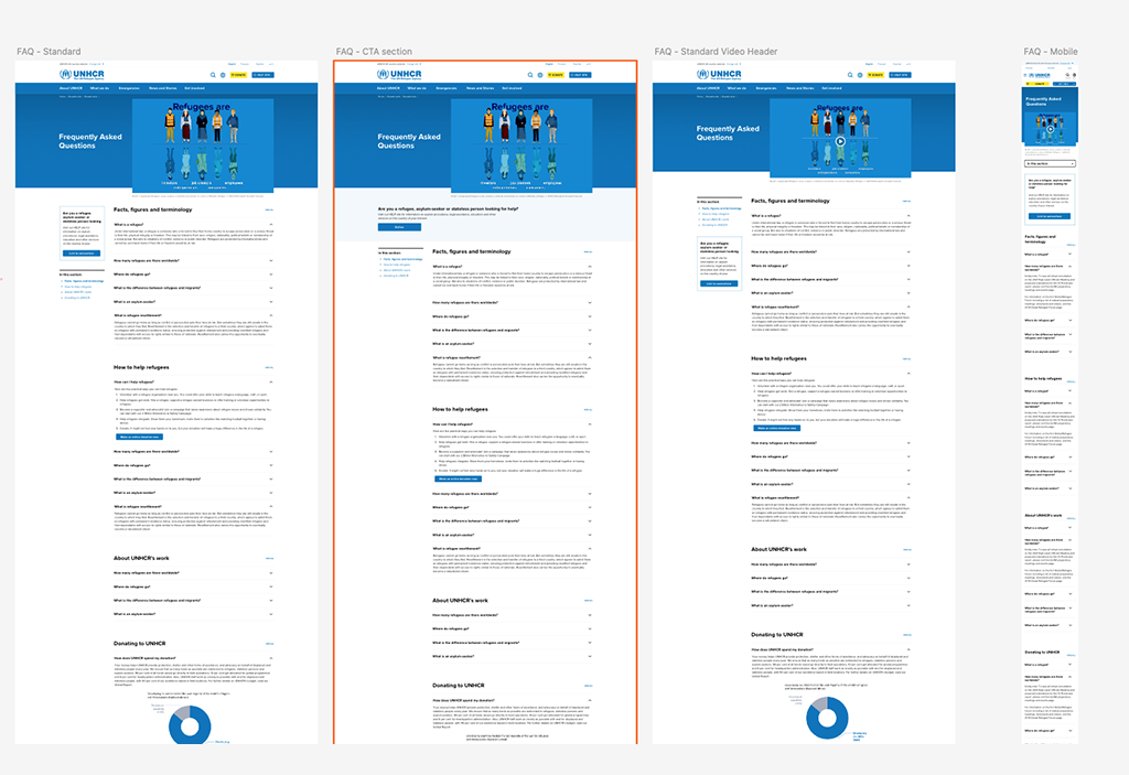
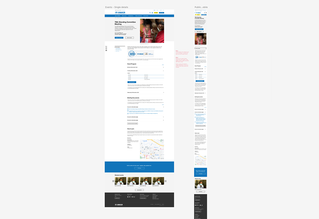
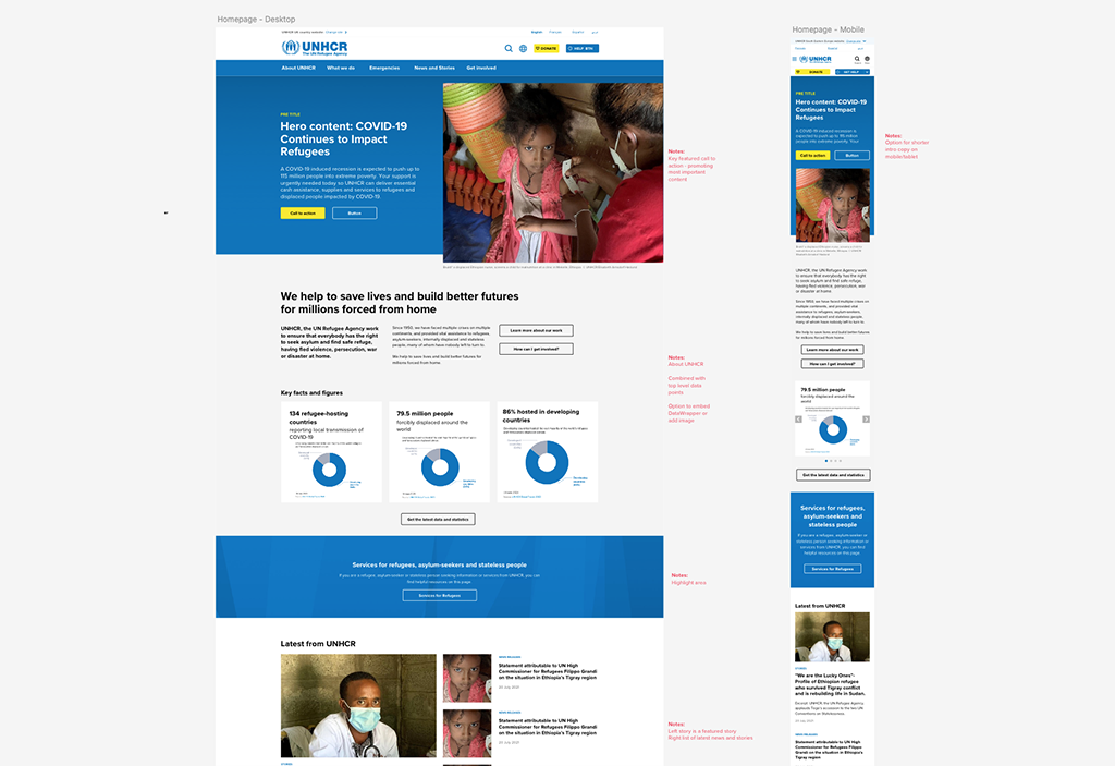
Templates that work for both Desktop and Mobile. Including, Homepage · News and stories · Landing pages · Emergency pages · Country pages · Events
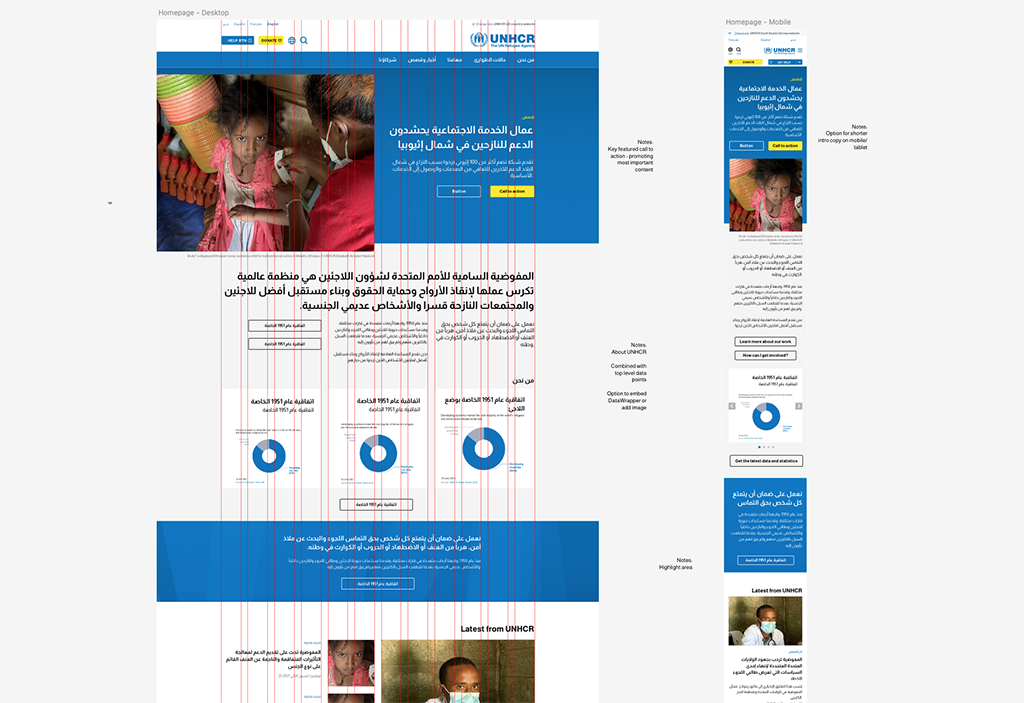
Right-to-left versions.
I designed Arabic versions of the templates and components, mirroring layouts, navigation and alignment so the experience feels native to right-to-left readers rather than translated.
The approach
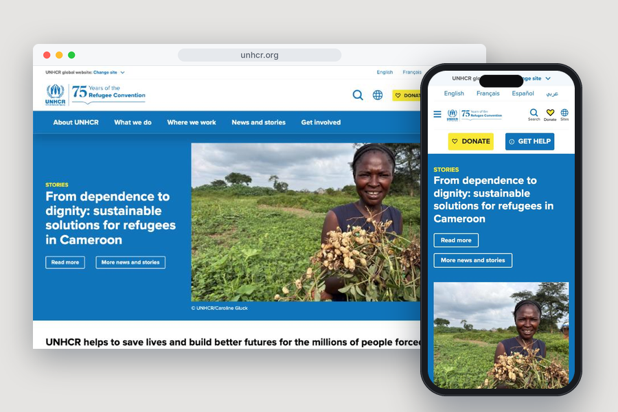
A homepage that shows more than news.
I replaced the carousel with a single strong hero section. Below it, data cards and featured news put the most important content where people can find it.
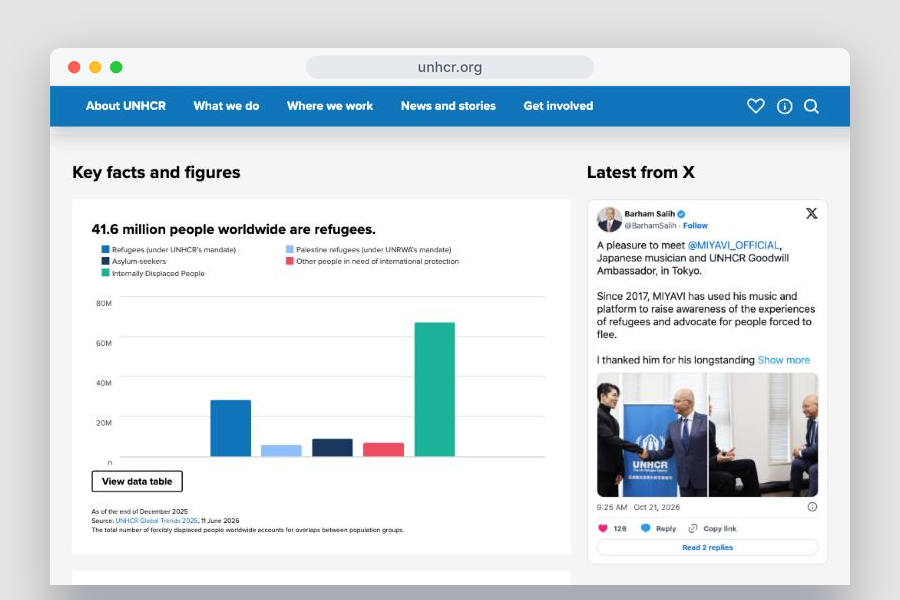
Data that’s hard to miss. I designed the data cards to make statistics visible and clickable and created prominent section on the homepage. That fixed the problem of links to data and reports being lost in body text.
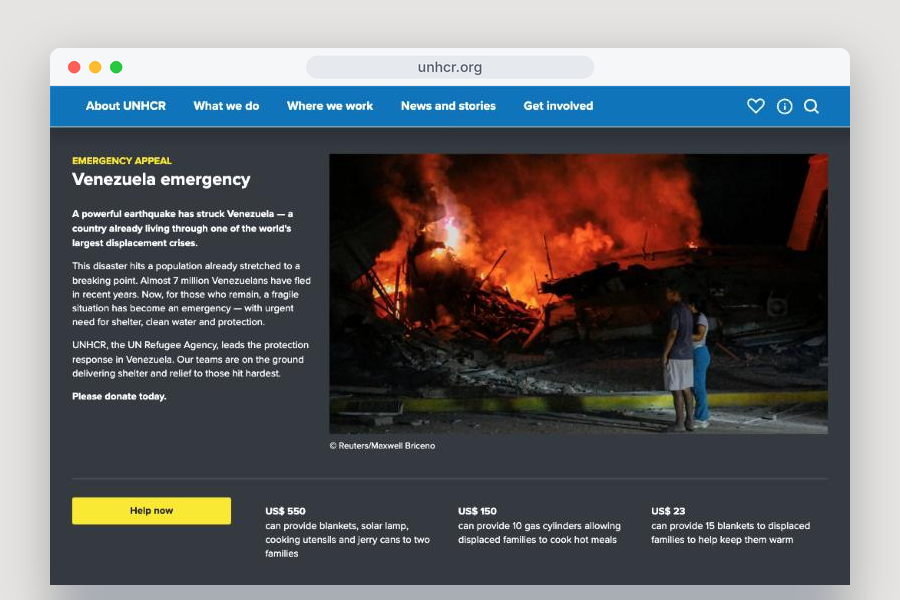
Ready for emergencies. I designed the emergency pages and sections so offices could launch a clear, consistent emergency page quickly when a crisis hits.
Flexible for editors, consistent for users. Each component works on its own, so editors can arrange pages freely and build good-looking pages quickly. Visual consistency is built into the components themselves, so editors don’t have to think about it.
Tested before it was built. I created concepts directly from the research findings, these were tested with users and refined before being handed over for development.
Resuts
- Implemented across 50+ sites in the UNHCR network
-
Became the foundation of the UNHCR UI toolkit, the shared design system now used across the organisation
-
10+ templates and core components, each designed for desktop, mobile and right-to-left (Arabic)